Change a schedule’s appearance
The visual appearance of the schedule and the overall user interface (UI) can be configured separately. You can change your schedule’s color palette by selecting another color theme or you can pick your own color for each of the different calendar elements. At the account level, you can do something similar for the UI colors. The appearance of the header is also configured at the account level. You can find the following instructions listed here:
- Modify calendar colors
- Change the color of schedule entries
- Adjust the resource indicator (Resource schedules only)
- Indicate the ownership of a resource or a service
- Set the color of empty cells
- Modify the base font size
- Change the color scheme of your dashboard
- Change the logo
- Set your favicon
Schedule appearance settings
Via Configure > Layout > Layout Colors you can configure the visual appearance of your schedule. The available options may differ somewhat, dependent on the type of schedule – Capacity, Resource or Service.
- schedule-level appearance for the booking calendar itself
- account-level appearance for the surrounding interface, logo, and header elements

Calendar colors
You can change the colors of your schedule by selecting one of seven color themes, which have been optimized for visibility and readability. Alternatively, you can manually change the color of one or more calendar elements. When you click the color swatch to the right of the element’s description, a color picker pops up that allows you to select a color or enter a six-digit, hexadecimal RGB color code. Any changes are directly reflected in the calendar snapshot on the right. However, changes are not applied to the actual schedule until explicitly saved.
Color of schedule entries
The color of a schedule entry, i.e. a slot in a Capacity schedule or an appointment in a Resource schedule, is set independently of a calendar’s color theme. When a schedule has multiple resources or services, each can be given their own corresponding color. There are 15 predefined colors, but you can select a custom color from a color wheel by selecting the right most radio button, marked with a rainbow icon. On a Capacity schedule you can also choose a pattern to apply to a slot, to indicate which slots are filled to capacity.
Resource indicator (Resource schedule only)
In case of a schedule with multiple resources, you can choose to show a color key above the schedule. This so-called resource selector can be used to filter the schedule and only show reservations for that particular resource. Instead of this color key, you can choose a dropdown menu or no selector at all. In addition to this, you can choose to have a color key shown in the calendar heading.
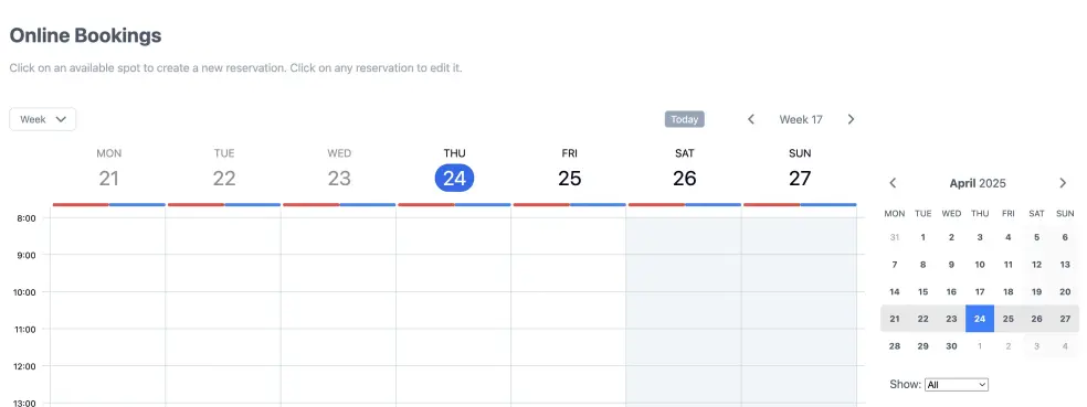
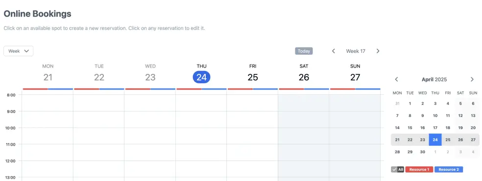
Ownership indicator
In a Resource and Service schedule, all the current, logged-in user’s reservations are overlaid with a distinct pattern. This allows the user to quickly spot their own reservations among those of others. In Capacity schedules, an ownership indicator such as a tick mark is used instead. You can configure which pattern or indicator will be used.
Color of empty cells
Resource schedules that work with fixed starting times and a predetermined length will explicitly show empty slots. You can set the color of these empty slots or choose to hide them instead.
Account appearance settings
Via Layout Settings changes can be made to the appearance of the overall user interface (UI). This includes the base font size, the color of various UI elements and the logo. These settings are account-wide, affecting all schedules within an account. If this is not what you want, you may want to consider creating multiple accounts instead.

Base font size
The default settings have been optimized for visibility and readability. You may, however, choose to change the base font size yourself. The system will scale most visual elements in relation to the font size selected. In older browsers, however, the result may not always be pixel perfect, especially at higher zoom levels. To avoid looking messy, certain elements are therefore kept at a fixed size.
Colors
You can change the colors used for text, links, headings, tables and various other UI elements. This can be useful when you want to integrate your schedule into your own website via a widget and want to align the color schemes. When you click one of the colored rectangles, a color picker pops up that allows you to select a color or enter a six-digit, hexadecimal RGB color code. You can always switch back to the default colors by clicking the “reset” link in the header.
Logo
By default, schedules are displayed with a SuperSaaS logo.
You can choose to hide this and use your own logo instead.
To do so, upload your logo in .jpg, .gif, .png, .svg or .webp format. The maximum file size is 100 KB, and you can resize your image during upload in SuperSaaS.
You can also provide a web address where people will be taken when they click your logo.
Users will be sent to this address when they log out from a schedule as well.
Alternatively, you can choose to hide the logo and/or breadcrumb bar altogether.
Favicon
The favicon, or shortcut icon, is the little graphic that appears in front of the URL or on the tab above it, depending on the browser. It is also typically shown in the History menu of the browser and its Bookmarks menu. To reassure a visitor that they are really on a site that belongs to you, you can provide your own favicon.

To show your own site’s favicon instead of the SuperSaaS favicon, go to Layout Settings and click the Advanced Settings link in the Appearance section. At the bottom of this page, you can specify a URL that points to a favicon.
If you want the favicon to work on older browsers it should be in a special icon format (.ico).
Modern browsers will accept favicons in .png or .svg format.
To create an .ico file, you will need a special purpose icon editor or convert a picture to .ico format with one of the free internet services that can be found through Google.
If you have not yet worked with favicons before, you may first want to read this article about the favicon from Wikipedia.